
*Updated 01|01|2021 to include example images from my portfolio as well as helpful tutorial links!
Portfolios are vital for the proper transition from student to professional life. They are not only representations of your design skills, but they also show who you are as a creative/ critical thinker and convey what you bring to the table to potential employers. It’s important to knock your portfolio out of the park, so here are my best tips for designing a great portfolio.
*Linked at the end of the post are my latest personal portfolio and an ISSUU stack which is a collection of my favorite portfolios I’ve found so far.
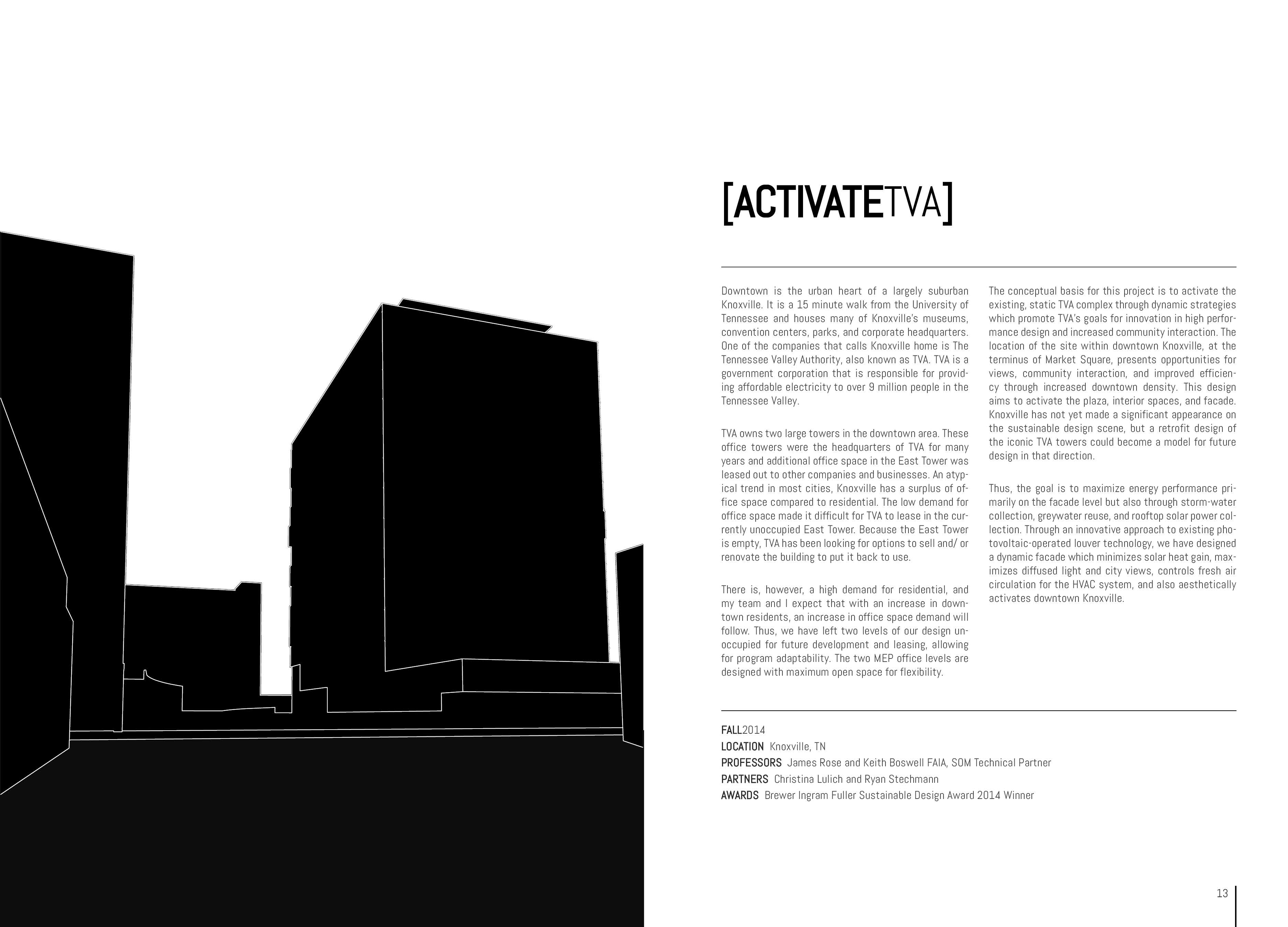
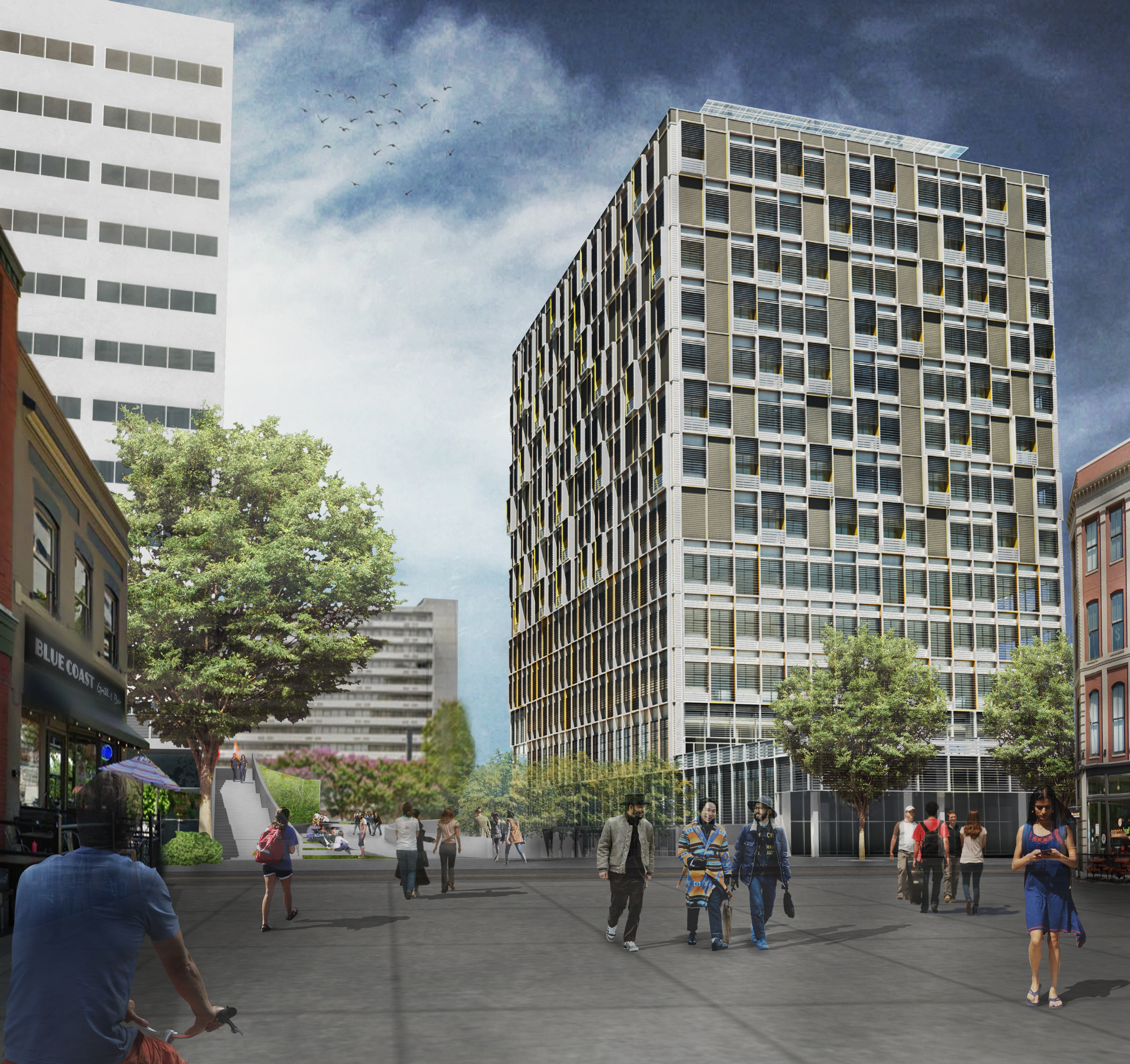
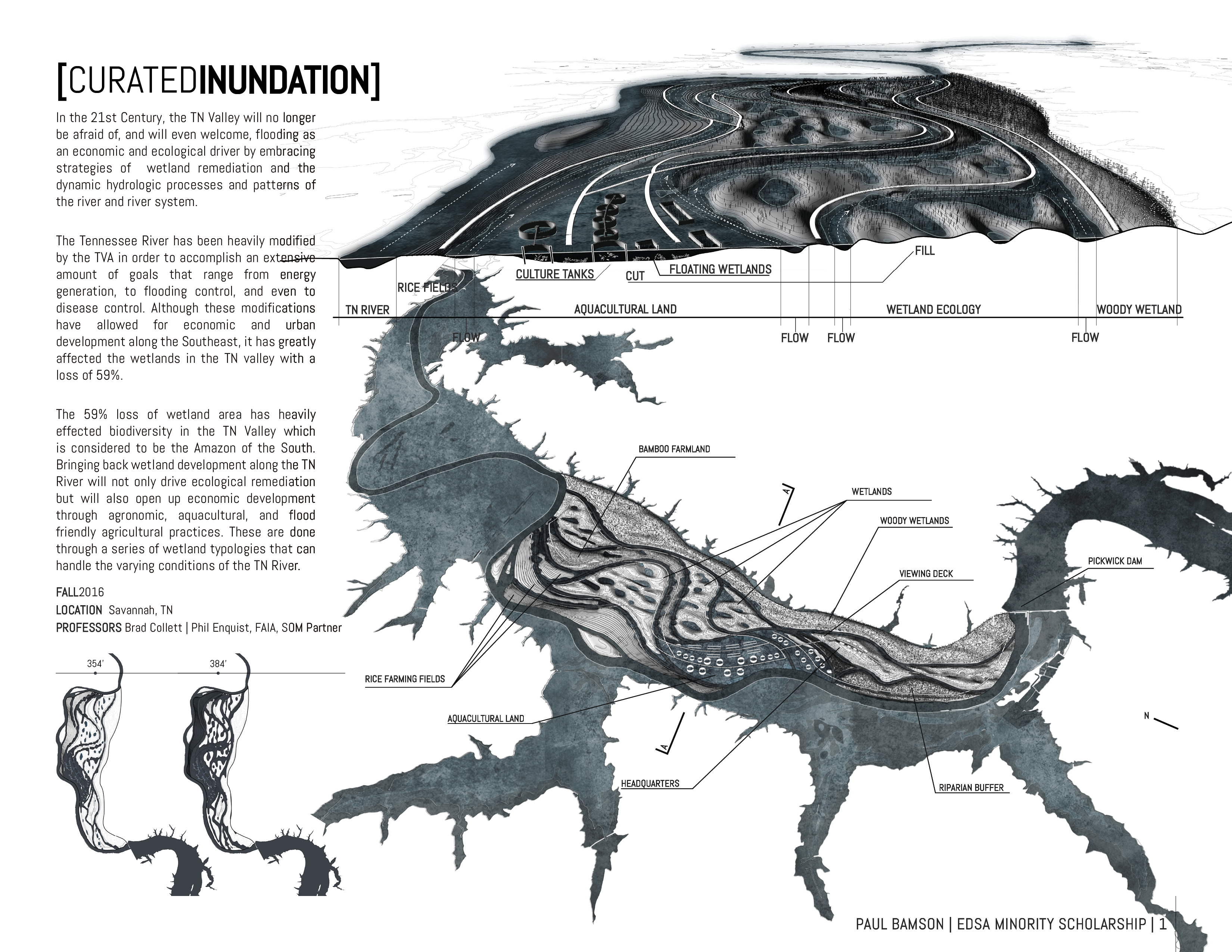
1. White space is your friend. Letting your pages breathe is very important for legibility. Don’t try to fit every drawing on one spread. It’s ok if your portfolio gets a little longer so each of your drawings are big enough and easy to read. Don’t be afraid to let a drawing span the entire spread if it helps with legibility. Note the use of white space in the spreads below. Treat negative white space as an object in your compositions that leads a viewer’s eyes to the most important elements in the spread.


2. You have a short period of time to make a strong impression. Include only your BEST work and keep it within 3-5 projects, starting with your best and ending with your second best as people often remember what they see first and last. You want what people remember to be your best and second best work for that reason. If you feel that you want to include an older project, don’t be afraid to go back and update it a bit. You want all of your projects to feel around the same level of resolution in your portfolio.
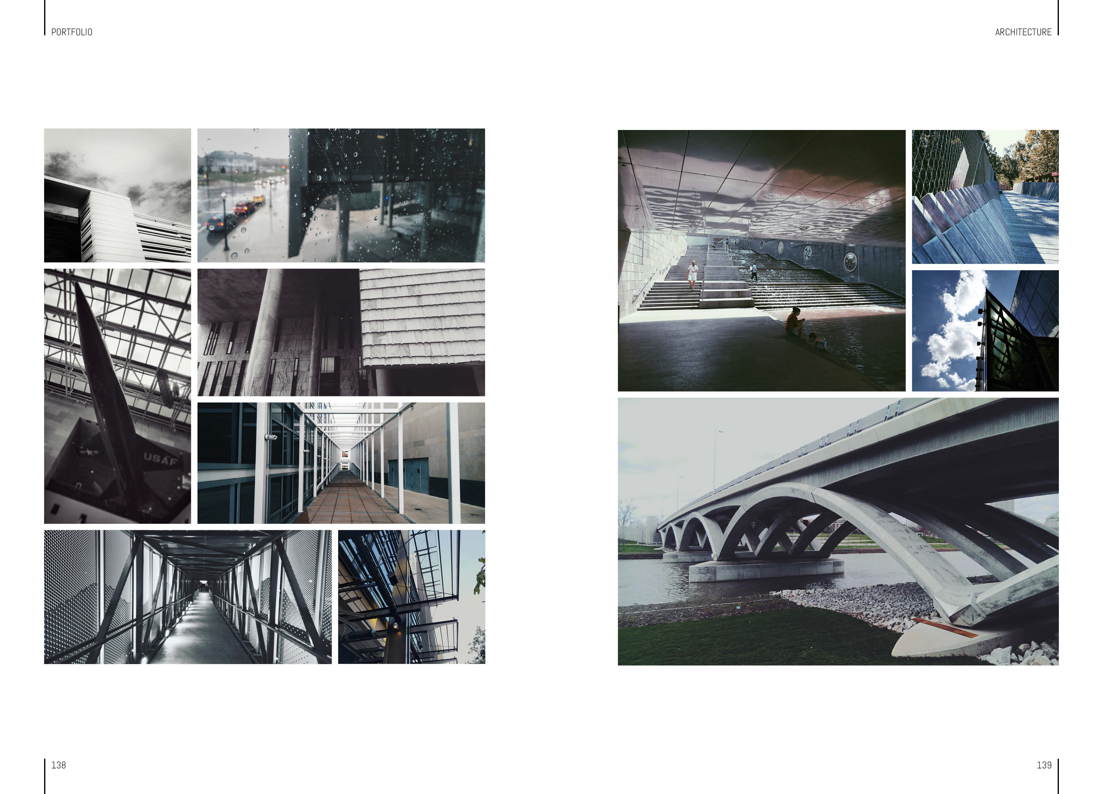
3. Also include creative work outside of architecture projects. Photos, drawings, paintings, hobbies, publications, web and graphic design, etc are great for showing a well rounded designer.

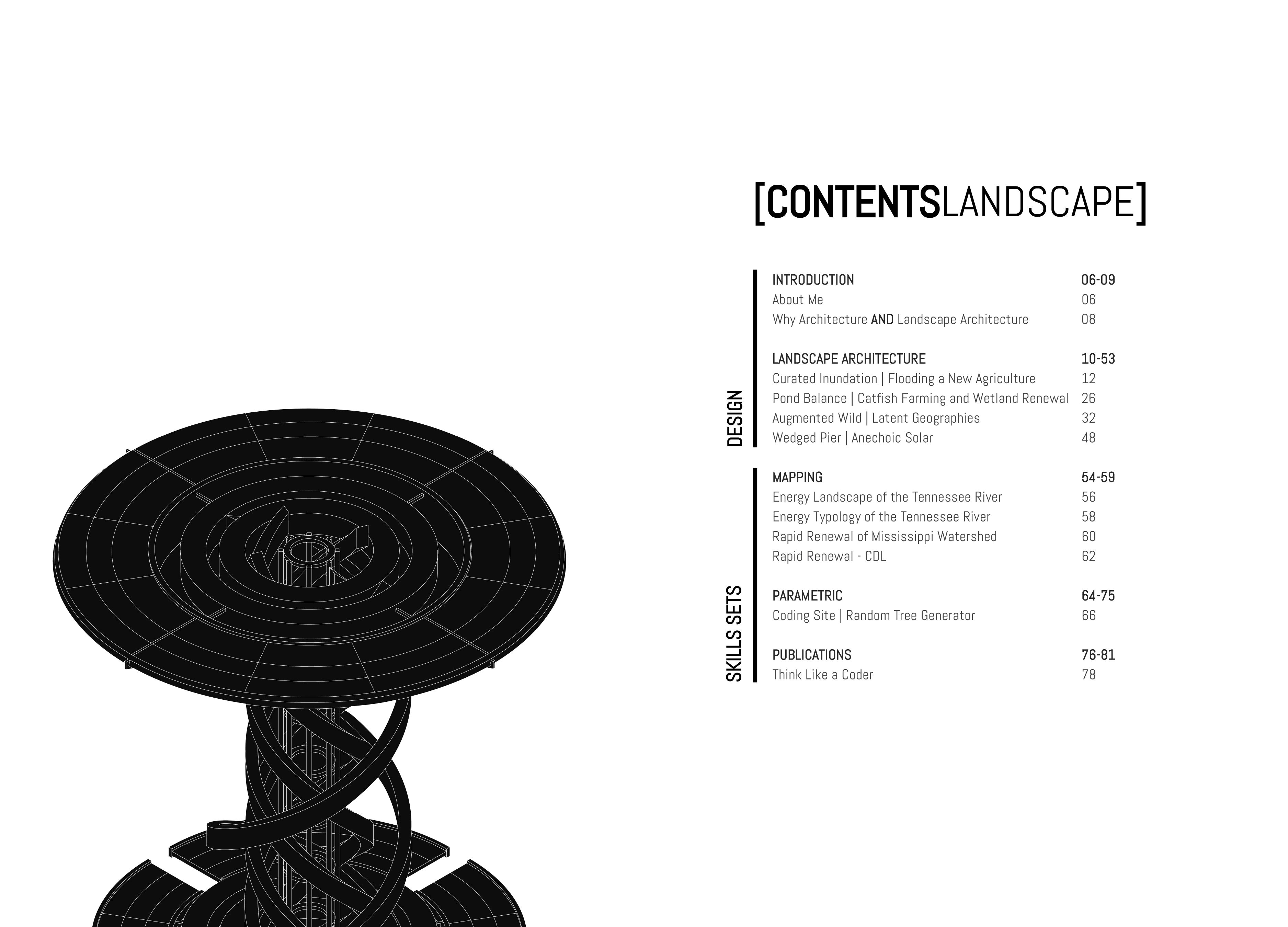
4. Once you have your projects picked out it is time to start organizing them in a way that highlights the strengths of each project and your design acumen. There are a few ways to organize your portfolio.
You can organize by:
1) Strongest to second strongest
2) Project Type (Residential, Cultural, Commercial, etc)
3) Project Categories (Architecture, Interiors, Landscape, Urban, Graphic, Industrial etc) (which is what I used in my latest portfolio.)
4) Size and Scale (Smallest to Largest, Largest to Smallest, Urban Scale to Product Scale, etc)
5) Student Work to Professional Work
To name a few…
There are a number of other ways that I hadn’t even mention but often the worst way is chronologically. Avoid this one! Think more strategically about how your projects are laid out so you don’t fall into the lazy presentation trap of “And then I did this, and then I did that”.
Think about how your Table of Contents page is laid out as well. Is it easy to navigate your portfolio? Does someone know that they have finished looking at one project and started looking at another? Include Title Pages and Category Pages to allow for easy portfolio ‘wayfinding’. In digital portfolios you can take wayfinding to the next level by including navigation links that allow a viewer to jump right to a specific page or project. Very handy if your portfolio gets as long as my final one did (which was admittedly 2 portfolios jammed into one Lol). A link to my latest portfolio with links on the Front Cover, Table of Contents, and even to external animation videos linked here. You can do this using ISSUU’s publication editing tools or even in InDesign using Buttons and Bookmarks to create Interactive PDF’s.


5. Keep it simple and use no more than two fonts. My favorite fonts, Abel, Trade Gothic LT Std, Roboto, Avenir LT Std. What are the fonts that you found yourself using over and over in your projects? Use those.
6. Use and stick to a GRID and Margins to create strong compositions. Keep text out of the edges of your page as they may be cut off during the printing and binding process. Make sure your drawings and text align. Be very intentional if you break the grid for the composition. Here is a link to a fantastic animated video showcasing layout and composition best practices by GCFLearnFree.org.

7. Take great, high quality pictures of your models and include them in your portfolio. Think about how the background of the photo effects your spread composition.
8. DO NOT take pictures of your hand drawings. Scan them instead and then edit them in Photoshop to get rid of the paper background. If needed, use a Black & White adjustment layer to get rid of color. Then use the Levels adjustment layer to separate the drawings from the paper. If you’ve achieved the look seen below with Black &White and Levels adjustment layers then you are golden but if you still can’t get rid of the paper texture behind without compromising the drawing, then Magic Wand the drawing to select the sketch marks. Create a mask from the selection and modify as needed to achieve the below look.

9. Strategically include process sketches and/ or study models in the project spreads. Potential employers are looking for strong process work along side your final drawings and renderings.

10. Don’t be afraid to go back and update your older drawings. You are more skilled now than you were when you first created them. Portfolios are meant to show your current skillset. Below are some drawings on the left from portfolio version 3 and the right from portfolio version 4. (Yes I call my portfolios ‘versions’ as I had been updating them yearly since 3rd year of architecture school. Don’t @ me lol but seriously, in your design career, starting early making portfolios is a great way to see how far you’ve progressed as a designer. All of my past portfolio ‘versions’ are available at my ISSUU page.) If you would like tutorials on how to improve your drawings, check out my You’re Doing It Wrong tutorial series on YouTube. There are loads of tutorials there ranging from Photoshop to Grasshopper and more!


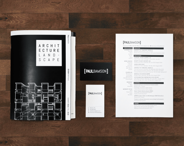
11. Start thinking about your brand. Create a logo and define your visual style. What’s your favorite color and what does it say about you? How can you incorporate that color as an organizing element in your portfolio?
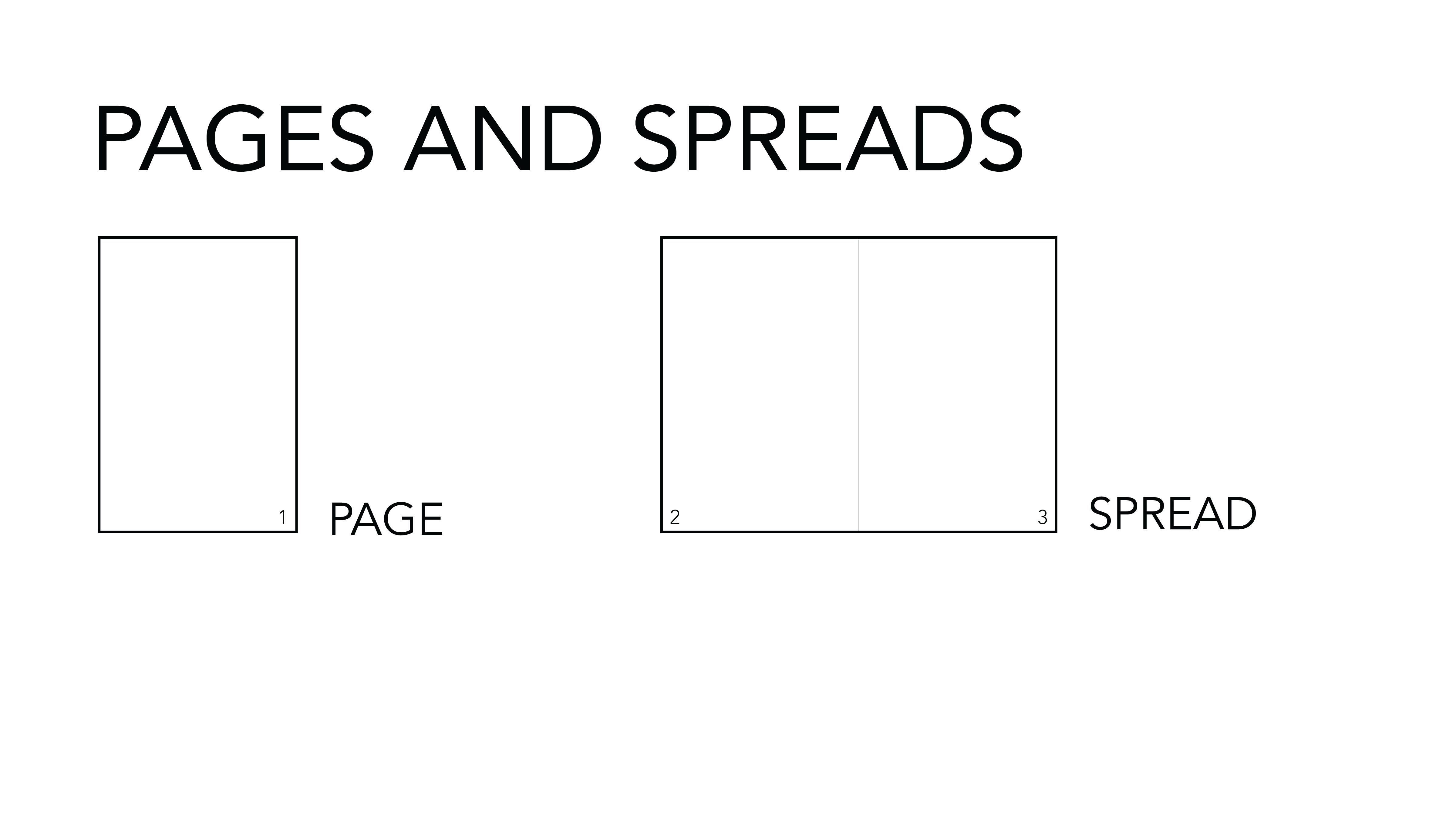
12. Pick the paper size that best fits ALL of your work. Should it be a portrait, landscape, or square portfolio? Find a bunch of your favorite books, publications, and sketchbooks that you love holding and measure their sizes. Copy the size of your favorite one. Think about how large the portfolio will be when fully spread out. This is especially important if you are using a landscape oriented portfolio. You want to avoid using any paper sizes larger than 8.5×11 (11×17 open) as they become cumbersome to carry around. Try starting with these sizes listed below and then modify to fit your specific portfolio (Add in .25, .5, or .75 extra inches to any dimension as necessary):
Portrait | 6×8, 6×9, 7×8 , 7×9, 8×9, 8×10
Landscape | 7×5, 7×6, 8×5, 8×6, 8×7, 9×6, 9×7, 9×8
Square | 6×6, 7×7, 8×8, 9×9, 10×10
13. Depending on submission requirements, You may be asked to submit work samples, which are single page previews for your projects, rather than a fully comprehensive portfolio. In that case, ease of printing is important. Consider using 8.5×11 or 11×17 size for those work samples so your potential employer can print them if they need to. Remember, these are summaries, or highlights, so only include the most important drawings for the work samples page. It is ok to include a link to the full portfolio if they want to see more of a given project.


14. Proof read, Proof Read, PROOF READ! Typos are the quickest way to get your portfolio over looked. Get others to read it to catch mistakes. A tool that I use often (even to this very day) to proof read my writing is text-to-speech software. Just copy your text into the box and hit play. You can also choose between many different voices and languages. ttsreader.com P.S. I also used this tool to do all of my school readings. Lol
15. Your portfolio is a designed object. You need to put as much time into it as you would any of the projects in it. As our profession becomes more competitive, it’s important to stand out and a well designed and crafted portfolio can do that for you. Consider cover material, binding, paper type and thickness, and size. Below you will see an example of my last portfolio in design school that cataloged my time in architecture school for undergrad and landscape architecture school for grad. I created a Do-Si-Do style portfolio with two front covers so it would be a choose your own adventure kind of experience when viewing my work. So have fun with your portfolio and make it unique to you as a designer!


16. Each firm is different, so don’t be afraid to customize your portfolio, and other stationery system items like resume, business cards, and cover letter, to fit the firm you are applying to.
17. Keep your portfolio and resume separate as your resume is likely to change more often than your portfolio will. You don’t want a spread in your portfolio to be out of date which means you’d have to reprint it later on. This, of course, is not as big an issue with the digital version of your portfolio as it would be with your printed version.
18. Remember, your portfolio will be printed! Be sure to consider total page thickness when designing your front and back cover. Here is a useful tool that calculates your spine thickness once you know the total number of pages and paper type you plan on using. Also, when in InDesign, the first single page is the first page visible when opening the book, not the cover itself when printing. This is VERY important so you don’t end up with shifted pages on your spreads where drawings start on the right page that should be on the left and end on the other side of that page.

19. Check out http://www.blurb.com/ for printing and binding of your portfolio. They provide amazing services and binding types including my personal favorite, lay-flat perfect binding. I recommend using them to get a professional looking portfolio book. Just make sure that you plan ahead as they will need time to print, bind, and ship it back to you.
20. Portfolios take time! Give yourself months in advance to compile your work, create your layouts, fine tune your spread compositions, and consider its materiality. Potential employers can immediately tell who threw their portfolio together last minute and who took the time to carefully craft the book that catalogs years of work. Honor the countless hours you put into your design education with a well crafted portfolio that shows how epic your skills are!
Bonus Interview Portfolio Tips
1. Remember, in an interview where your portfolio is being presented, you may only get through the first two or three projects before a potential employer has made up their mind about you. Be sure to gauge their interest as you’re presenting and you do not have to present in order either if you think a project later in the order would be better to present next. If you have made it through the entire portfolio during the interview (if it is a decent size with 4 or more projects) maybe the interview hasn’t gone so well.
2. You are not obligated to show every project during the interview. If you present 1 or 2 and then the rest of the interview is conversation about the work or design ideas, etc, that’s a good thing! It means the potential employer has already seen everything they need to know that you have the skills and design thinking necessary to do the job. Now they want to get to know you as a person and whether or not you would be a good fit for the firm or practice.
3. Do your research on the firm! Know which of your projects align most closely to the firm you are interviewing with. Present those projects first. (Or have a few versions of your portfolio that organize the projects in a way that would appeal most to the firm that you are applying to.)
If you need some extra eyes on your portfolio, I would be glad to review your portfolio and provide critical feedback through Google Hangouts or Zoom. Contact me and we can go over details. paultbamson@gmail.com | 615-568-3957 | Instagram
My Latest Portfolio
http://bit.ly/ptbportfolio
My Favorite Portfolios Stack
http://bit.ly/portfolio_stack
Here is a link to a tutorial video I created for managing the file size of your portfolio while maintaining high resolution for submissions that specify a file size limit.
https://youtu.be/oua64q38I2w
